Wednesday 18 April 2012

College magazine first drafts

Draft of front cover for the college magazine
Draft of contents page of college magazine

Orignal images for magazine


Final Magazine Cover

College magazine contents page

College magazine evaluation

The purpose of this post is to evaluate my front cover and contents page of my finished  college magazine.

How does my magazine follow the codes and conventions of a college magazine?
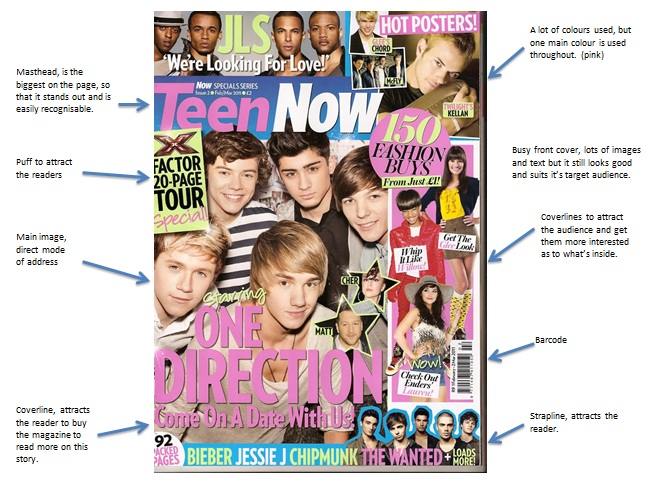
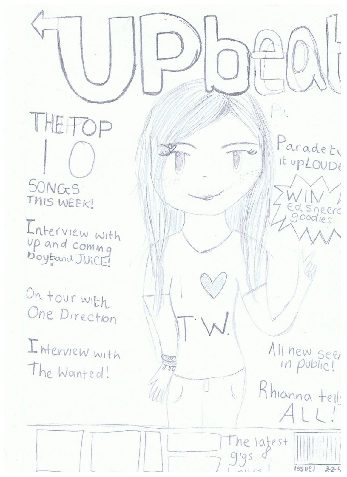
Front cover:

-My magazine front cover’s main image is a medium close up of one of the students at college this fits in with the codes and conventions of a magazine because it fits in to the typical magazine look.
-I have also put the title at the top of the cover so that it fits in with the codes and conventions, I also made the title big, bold and a different text to the rest of the magazine to make it stand out and so that the readers eyes are immediately drawn to it.
-I have also used a banner at the bottom of the page; the purpose of this is to make the information on it stands out but also is one of the main codes and conventions needed on a magazine.
-I have also put the barcode at the bottom right corner of the cover; the purpose of this is so that it fits within the normal magazine aspects.
-I also made it so that the main image overlays the logo/title of the magazine, the purpose of this is so that even though the logo isn’t fully visible it is an easy recognisable logo so it will not matter.
- I have also used puffs, which attract the viewer to pick up the magazine and make them want to buy it to see how they can get it
-I played around in Photoshop until I get the magazine exactly how I wanted it to look

Contents:

-I have used 3 columns on my contents page so that it is easily readable by the reader. This fits into the codes and conventions of a typical magazine because they normally have 3 or 4 columns on there contents page
-I have used several images which link to the tagline I have used so that the reader can get an insight into the story and therefore it makes them want to read on
- I have also used the line tool on quark to split up each story line, the purpose of this is so that the text is easily readable and doesn’t clump and make it look like there is too much information of the page
- I tried to use a number of different tools on Quark to create my final product

How have I used new media technologies to create my final product?

Photoshop:
-I have used Photoshop to manipulate my main image so that it had a plain coloured background instead of the white wall that was originally there.
-I have chosen a text to use as my logo/title for the magazine and this text font will not be used no-where else in the magazine expect for this title
-I have gained a number of skills on Photoshop aswell as developing the skills that I have before.
-Lasso tool- I used to this to select the background of my main image and then used the feather tool to feather it and the fill tool to change the background colour

Strengths:
-I’m a quick learner so I find it easy to just have a mess around with all the tools until I find the one that will do what I want
-I already have skills in Photoshop so this can make it much quicker for me to create my front cover
-I have worked creating a music magazine before at high school so I already know some of the codes and conventions that need to be added using Photoshop

Weaknesses:
-Sometimes I take too much time trying to make it look perfect and keep messing around with it for a while

Quark:
-I have learnt how to use the basics of Quark in order to create a successful contents page
-I have experimented with different setting to create my overall final design
 -I have learnt how to import pictures and resize them
-I have learnt how to format text to have drop caps; the purpose of this is to make something bold and big and to stand out
-I have also learnt how to change text styles, colour and size

Strengths:
 -I find the programme quite easy to use, so therefore I can finish my work quickly

Weaknesses:
-I’m not confident with all the tools, as I have never used it before
-Some of the tools can be tricky to use
- It was difficult to change the sizes of some photographs, as they would only go as small as a certain size

Using Pentax K100D:
-I have been able to take photographs which are of a high quality enough so that they are good enough for my college magazine
-I have been able top take images at different angles/shots to suit my magazine

Strengths:
-It’s my own camera so I’m used to using it
-It’s easy to use
-I can take high quality pictures, which means I will get a better edit

Weaknesses:
-Large photo files, they take up a lot of space

Overall I think that this project went successfully as I managed to stick to my deadlines and create a magazine cover and contents page which fits in with the codes and conventions of a normal magazine. I think that also beacuse i have created thiks magazine before starting my music magazine it have give me the chance to try a new programme (Quark) and know how to create a magazine which fits the codes and convetions.
Inital Plan

Genre- POP

Price £2.50

average size-60-65 pages

Description- My magazine will be based at young girls who are intersted in Pop music such as boybands and girlbands. The colours which I will use will be traditionaly girly. I win also include competions so that it attravts the target auidnece.

Music Magazines

  • Metal hammer-Metal
  • NME-Indie
  • Q-Indie alternative
  • Kerrang-Rock
  • Smash hits-POP
  • Top of the pops-POP
  • Uncut-Classic rock
  • MixMag- Dance
  • Rock sound-Rock
  • Pianist-Classical
  • Jazz wise-Jazz
  • Guitar World-Rock
  • Scuzz-Metal
  • Guitar-Rock
  • The source-R&B
  • Clash-Indie/punk
  • The rolling stones-Rock

Magazine Research

Top Of the Pops
Price- The price varies depending on what is in the issue but it never more than £3.00.
Frequency- Monthly
Distribution: Newsagents and supermarkets

Issue size- 62 -pages 
Style- Relaxed, chatty and informal.
Rationale- Both perspectives of the fans and the people in the business as the interviews, reviews ect. are written by people in the business, but fan's can write in and have there say in the form of letters.
Features-The world of The Wanted, reader survey, Taylor Launter, Strictly personal with Harry Judd, Loving your look, Winter blues.  
Regulars- your problems solved, competitions, Oops Embarrassing celeb snaps, Gossip2go, We love shopping, high street hotlist, Everyone's wearing..., your stars, your say.


Teen now
Even though Teen Now isn't a music magazine it is aimed at the same audince that I want to aim my magazine at, so I think that by looking at this magazine it will help me design my own to suit my target audience

Price- £2
Frequency-Monthly 
Issue size-92 pages
Distrabution-Newsagents, supermarkets
Style- Informal, chatty and short paragraphs.
Rationale- Both fan's and editiors perspective is used to give the opinion of both.
Features-One direction, Twenty Twety, The Wanted, X-factor quiz, Jessie J, Jason Derulo, Breaking dawn 
Regulars-This month were feeling, the hottest news, now your talking, horoscopes, problems, real life role models, Beauty news.

Bliss
Even though Bliss isn't a music magazine it is aimed at the same audince that I want to aim my magazine at, so I think that by looking at this magazine it will help me design my own to suit my target audience


Price- £2.50
Frequency-Monthly 
Issue size- 98 pages 
Postioning statement- The UK's BIGGEST teen mag
Style- Informal, chatty style makes the reader feel as if they are reading something from a friend rather than a editor.
Rationale- Both fan's and the editors point of view. 
Features- You booze, you lose?, Waiting to date, The wanted, Meet Belle aime, Cake that!, The acid test, Patz amazing!  
Regulars- Yourspace, OMG!, Shop 'til you drop, subscribe, book club, surgery, blisscopes


Using Photoshop and Quark for my college magazine.

Photoshop
To create my front cover for my college magazine I used Photoshop, I think that I managed to quickly create my magazine front cover as I have worked in Photoshop before and I think that I have some good skills on it whilst using the program.  I already knew how to use all of the tools that I used to create my magazine so I think that I managed to do a good job and make the front cover successful and I then that it looks good , but also would suit the target audience. 

Quark
As I already have experience with using Photoshop I think that I managed to successfully pick up how each tool works quite quickly. One problem that I had was trying to find the drop caps tools, but i asked one of my classmates and they showed me how to do it and now I feel as if I can do it confidently on my own. I think that my contents page was successful and it turned out how I wanted it to look.

Questionnaire

This is a blank copy of my questionnaire, i will ask 20 people to fill this out and I will then collect the results and anaysle them.

Publication plan

Title: UPbeat
Target Audience: 13-19 year old girls
Price-£2.50
Frequency of publication- Monthly
Issue size- 95 pages
Distribution- Supermarkets and Newsagents
Rationle: The approach of the magazine includes both the fans perspective's and the editiors, as the e.g. interviews, reviews and updates will be written by the editior but in a informal way so that a friendly approach is showed to the fans. The fans perspectives with we involed by e.g. letters, celebs in public as the fans get to have there say and put there letters in the magazine making them feel more involed with the magazine and alos so that the other fans get to know what they want to know and not just the editior's opinions.

Style- Informal and relaxed style with short paragraphs. This magazine is for young people so will use slang and simple vocabulary so that it suits the target audience. There will be a balance of both images and text in the articles so that it will not be too overaloaded with infomation, but also so that it suits the target audinece.


Regular content:-Editor's Note
-Updates on new concerts, gigs and different bands
-Tune of the month- lets the reader get involved in saying what they think the 'tune of the month' is and the results will be revealed in the next issue 
-'Seen in public' images of celebs who have been spotted by readers of the magazine and there picture included 
-Top 100 fashion buys and tips
- Fans say- letters from fans of the magazine can write in and have thier letter in the magazine, also there is a wite up form the editor thanking them for writing in.
-Quizzes, so that the reader has a cahnce to have fun but also to try and win prizes.

Feature Content:-Competions- Win signed stuff and gig tickets from different artists 

-Interview with JUiCE
-A day with Parade
-Interview with boyband the Wanted
-Tips on singing 
-Review of a Mcfly's gig
-Music at Children In Need
-On tour with One Direction
-Parade signing
-Rhianna tells all
-Free posters from All Time Low,  Katy Perry and more
-See new unsigned bands and artists!
-Will you grade top of the charts?
-Mcfly’s new songs   reviewed!
-Subscribe now for the perfect start to 2012!

House style:
Coverlines: Britannic Bold


Headlines:  Cooper Balck
Standfirst:Bold Cambri body
Captions: Arial rounded MT bold
Features first paragraph: Bell MT bold
Body text: Bell MT
Colour scheme: Blue, Purple and Black


Analysis of Top Of The Pops, cover, contents page and double page spread

Front Cover

I think that this design is simple but effective as it dosen' overload the reader with too much information but gives them just enough so that they want to read on.
Contents page

Double Page Spread
Overall I like this double page spread as i think that it suits it's target audience well, one way it odes this is by the coulor scheme as TOTP is aimed at teenage girls a very girly colour scheme has been used when creating the article. This is something I need to think about when creating my own magazine as I need the colours to be liked by my TA this is why in my questionnaire I plan to ask what colours my target audience like the best and I will then be able to use the most liked colours them in my magazine. 
I have also noticed that the interview questions are very informal and let the readers get gossip on the band aswell as talking about there music. When creating my own music magazine I will try to include both questions about what the band have been up to but also get some of the gossip on the band as I think that this is what the readers are looking for an interview as it means that they get to know the band better. 
I don't like how there is only two columns used, when I create my own double page spread I will make 3 0r 4 columns as I think it looks more professional and it also makes the text look more that just a massive block of text.  I think that the right amount of pictures have been used for this article expect I do not like that they have used a picture that looks the same as the main image I think that they should of used a different image and I will make sure that I do this in my article. 

Bliss magazine analysis Front cover, contents page and double page spread

Even thought Bliss magazine is not specfically designed to be a music magazine for teenagers it's target audience is teenagers so i thought that it would be good to look at as it will help me to see what teenagers what in a magazine.
Front cover
Contents Page
Double page spread
I like this double page spread as it manages to use both images and text to create an article which suits it's target audience but also manages to look slick and stylish and appealing to the eye.


Teen Now analysis of front cover, contents page and double page spread

Even though Teen Now is not a music magazine I have chosen to anatate it because it is aimed at the same target audience that I want my magazine to be aimed at.
Front Cover
Contents page 

Double page spread

Codes and Convetions of music magazines

Front cover
-They all have one main image, which is in the middle of the page
-they all have a colour scheme which is mostly 2/3 colours
-Big bold titles, which are bigger than the logo's
-The price and issue are next to the title
-The barcode is at the bottom on the page in either corner
-The page is full with information but not so much that it is too crowded
-The main image used is a studio photograph, with a white background
-The titles of the magazines are covered but as they are that well know we still know what they are
-Puffs
-Competitions to draw in the audience
Strips across the top or bottom
-Skylines
-The main image used are direct mode of address
-The mast head (title) is a unique font to the rest of the magazine and it will never be used on any other part of the magazine except from the title
-Captions/cover lines on both sides of the page
-Bright colours to attract the attention of the buyer
Contents page
-3 or 4 colomns
-The same colour scheme as used on the front cover
-Alot of infomation
-Samll font size- never bigger than 11 expect the title
-Editors note
-Plain backgrounds so that the text is easy to read
-Structred layout
-Web adrees at the bottom of the page
-Issue date
-Direct and indircet mode of address pictures
-The colomns are divided into catergories/headings
-one main story with a picture which is bigger than the rest Sublines, specfic detail

Results from the Questionnaire

This is a slideshow for my results of my questionnaire: Results from the Questionnaire
View more presentations from BethFurbey.
These video's are of two questions off the questionnaire which I picked to ask to two different young people.Below are the video's:

Planning Production

This is my sketch of my front cover of my magazine.  

This is a plan of what I want my contents page  to look like,I have made it fit in with the same theme as the front cover. 
This is a sketch of my double page spread. 


Article research

I looked at double page spreads in existing magazines for the sort of questions which I will ask the band 'JUiCE'. From this I found out that the questions are chatty, informal and sound as if they are taking to a friend. There is mostly gossip questions asked but also there is questions which ask about tour dates and gigs.

These are some of the questions I found as inspiration for my own questions:
'Who's the better singer-Dappy or Frazer?'- TOTP
'Hi Dev, great to meet with you! What have you been up to in the UK?'-TOTP
'Is the new album a bit more dancey than the last one?'-Teen Now
'So what do you find really attractive in a guy?'-Teen Now
'We you tempted to go out in disguise to hide from the fans?'- Bliss
'Where do you keep your awards? The loo?'- Bliss

From these questions I have learnt that they are all a informal, chatty style which lets the reader get personal with the artist and get to know more about there day to day life and not just their gigs. From this research here are my chosen questions:

My interview questions:
-Hey JUiCE, we can’t wait to see more of you! So what’ve you got planned?
What sort of sound would you say that your music is?
-What made you want to start a band?
What's been your favourite gig so far and why?
Saying this, What venue do you aspire to play at one day?
Are there any acts in the UK currently that you would like to work with?
If you could be anyone else for a day who would you be and why?
Now let’s get JUiCEY! What sort of girl do you go for?
So you have a song called ‘Accidentally girlfriend’ the big question is, would you ever date a fan?
If you could live in a TV series which one would you live in and why?
I will also be asking 2 or 3 fans to say what they thought of the gig ect. theses are my chosen questions below.
How and where did you first hear about JUICE?
On a rate of 1-10 what would you rate there gig and why?
What's your favourite song of there's to hear live? 
What bands/artists do you think they are similar to and why? 
Would you ever go to the concert again? why?
I researched the bands for there likes dislikes ect. so that I could include these in my article. Firstly I started off by looking at there facebook pages:

I then looked at the bands facebook page for more information. 

Fan interview questions and responses:
How and where did you first hear about JUICE?
Sarah: ‘My friend (@nickylovesmcfly) has supported them for 2 years and i'd keep seeing her commenting on their twitcams, and nicky was always raving about them so I thought i'd check out one of their twitcams and bam they had me’
Louise:  I went to Townley live in August 2011 and they were playing which made me want to know more about them plus my friend Beth who came with me wouldn’t stop talking about them!
Heather: I found out from my friends as some of them already knew them and they got me listening to them on Youtube and looking at their page on Facebook
On a rate of 1-10 what would you rate there gig and why?
Heather: I’d say 9! Because the band were absolutely amazing and it was really enjoyable, the only thing that let it down was people who had bought tickets cheaper than me were allowed to push to the front and this spoiled my view, but all in all It was one of the best concerts I’ve been to!
Sarah: 10 it was absolutely amazing. The best I have ever seen the boys perform! I'm just so proud of them even though they did make me cry at one point.
What's your favourite song of theirs to hear live?
Louise: Accidently girlfriend! It’s just really catchy and sticks in your head! I loved the covers that they did too.
Sarah: I love Hope for the best prepare for the worst. It's such an amazing song, and the boys (especially chris) sound stunning. It makes me cry every time I hear it. I also love Alright too.
Heather: I’d say Lets Go even thought I love all of their songs, there’s just something about it that makes me smile and sing along.
What bands/artists do you think they are similar to and why?
Heather:  I think there quite pop, so like a One Direction mixed with Mcfly sort of sound.
Louise: Mcfly and Busted.
Sarah: They have a very pop/rock sound. Quite similar to McFly and Busted, although I hate it when they are introduced as 'the next McFly' McFly are McFly and JUiCE are JUiCE they are similar but there are differences.
Would you ever go to the concert again? Why?
Sarah: Yes! Completely I want to go back and relive it over and over again. I miss the boys already!
Louise: Defo! I want to go VIP too, the boys are so nice and put on an amazing show which I wouldn’t want to miss!


Production

I did a photoshoot with Abbie who is the model for my front cover so that I could get the image for my cover. Below are all of the images that I took without being edited.


This shows my chosen image and how I edited to get my final image for my front cover:


View more presentations from BethFurbey.
When I started editing my front cover I found out that this image did not suit my front cover so below is my new image and how I have edited it.
Editing my front cover image
View more presentations from BethFurbey.
Contents page original  images.